Color Psychology and Emotional Balance
Understanding how neutral palettes and soft tones create psychological comfort and support restorative sleep in your home
The Science Behind Color and Well-being
Color is far more than aesthetic preference—it's a powerful psychological tool that directly influences our emotional state, sleep quality, and overall sense of peace. In Japanese design philosophy, the relationship between color and harmony has been understood for centuries. This article explores how carefully chosen palettes can transform your living space into a sanctuary of calm.
When we surround ourselves with specific colors, our brains respond with measurable changes in cortisol levels, heart rate, and sleep architecture. Understanding these connections allows us to design spaces that actively support our well-being rather than simply looking attractive.

Neutral Palettes as Foundation for Calm
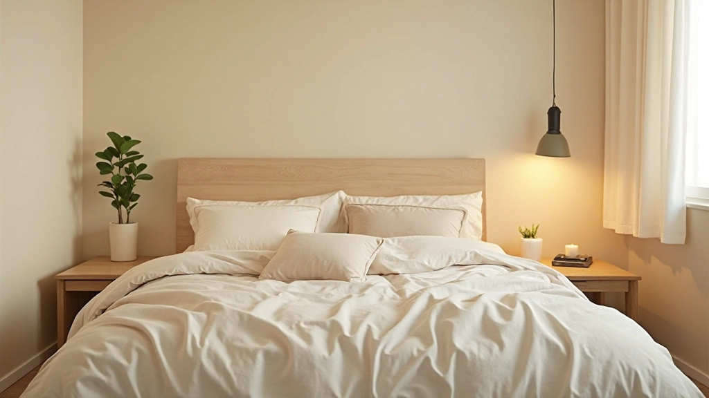
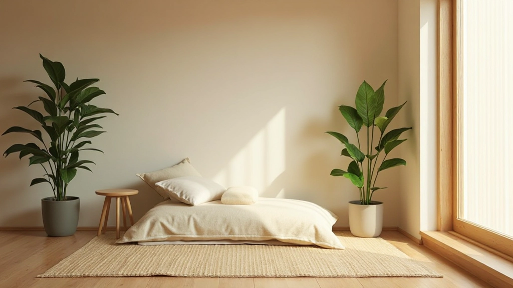
Neutral colors—soft whites, warm grays, gentle beiges, and muted taupes—form the psychological foundation of restorative spaces. These tones have a unique ability to quiet mental chatter and create a sense of visual rest. Rather than demanding attention, they provide a stable backdrop that allows the mind to settle.
Research in environmental psychology demonstrates that neutral environments reduce cognitive load. When your visual field isn't constantly stimulated by bold or contrasting colors, your nervous system can transition into parasympathetic dominance—the state necessary for deep relaxation and quality sleep. This is why many sleep clinics recommend neutral bedroom palettes.
Why Neutrals Work
- Reduce visual stimulation and mental fatigue
- Create visual continuity and spaciousness
- Provide flexibility for seasonal and personal changes
- Support circadian rhythm regulation
Warm vs. Cool Neutrals: Finding Your Balance
Not all neutral colors affect us identically. Warm neutrals—creams, warm grays, and soft beiges with yellow or red undertones—create a sense of comfort and embrace. They psychologically lower blood pressure and promote feelings of safety and nurturance. These are ideal for living spaces where you want to feel welcomed and supported.
Cool neutrals—soft whites with blue undertones, cool grays, and silver-tinged taupes—promote clarity and focus. They feel crisp and spacious, making them excellent for home offices or meditation spaces. The key to emotional balance is understanding which warm or cool neutral resonates with your nervous system's natural preferences.
"The most profound beauty in Japanese design comes not from what is present, but from what is absent. In color, this means choosing palettes that whisper rather than shout."
— Interior Design Philosophy
Building Your Emotional Color Foundation
A systematic approach to selecting and implementing colors that support psychological balance
Assess Your Current Nervous System State
Before selecting colors, understand your personal baseline. Do you tend toward overstimulation or under-stimulation? Do you feel energized by activity or drained by it? Your natural state guides whether you need calming cool neutrals or grounding warm ones.
Establish Your Primary Neutral Base
Choose one neutral for 60-70% of your room—typically walls and larger surfaces. This becomes your psychological anchor. Sample paint colors in your actual lighting conditions over several days to ensure the undertone feels right for your space and nervous system.
Layer Subtle Accent Tones
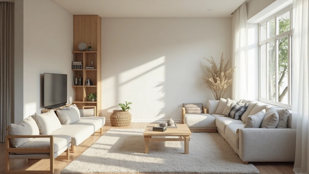
Add secondary neutrals (20-30% of space) through textiles, artwork, and furnishings. These subtle variations prevent monotony while maintaining psychological calm. Think warm white trim against cool gray walls, or soft beige accessories on cream base.
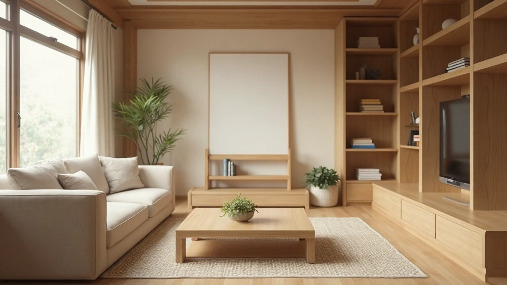
Introduce Natural Material Colors
The remaining 10% comes from natural materials—wood grain, stone, linen, and wool. These organic colors anchor the space psychologically, connecting us to nature's calming influence and creating sensory richness within a neutral palette.
Colors That Support Sleep and Restoration
Essential color combinations for spaces dedicated to rest and emotional recovery
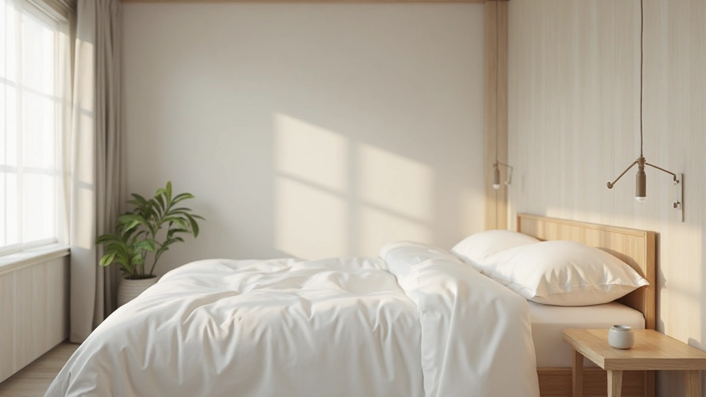
Soft White Foundations
Warm whites with subtle cream undertones create psychological safety. They reflect light gently, supporting melatonin production while feeling inviting rather than clinical.
Earthy Gray Accents
Grays with warm undertones ground us psychologically, mimicking natural stone and soil. They promote stability and reduce anxiety without inducing drowsiness.
Warm Taupe Layers
Taupes bridge warm and cool, creating visual balance. They reduce cortisol levels while maintaining subtle visual interest that prevents sensory deprivation.
Natural Material Tones
Wood warmth, stone neutrality, and textile textures introduce complexity that our brains find psychologically comforting, creating richness within simplicity.
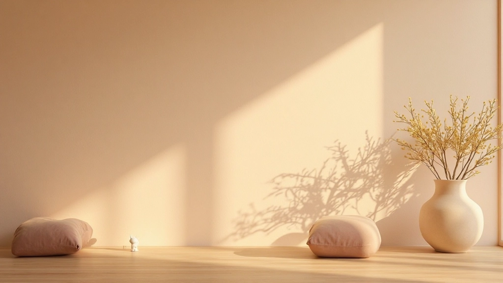
Light and Shadow Play
How light interacts with your neutral palette is as important as the colors themselves. Warm light makes cool neutrals feel cozy; soft light on warm neutrals creates sanctuary.
Seasonal Harmony
Neutral palettes allow textiles and accents to shift seasonally, supporting our natural circadian and emotional rhythms without requiring structural changes.
Avoiding Color Psychology Mistakes
While neutral palettes are inherently forgiving, certain combinations can work against your emotional balance. Understanding what to avoid is as important as knowing what to embrace.
Common Color Mistakes
- Overly Cool Whites: Pure white with heavy blue undertones can feel cold and institutional, activating alertness rather than calm
- Muddy Neutrals: Colors that lack clarity or undertone coherence create visual confusion and psychological unease
- Insufficient Contrast: When all surfaces are identical neutrals, the space feels flat and psychologically boring
- Ignoring Light Quality: The same color looks dramatically different in warm versus cool light; test thoroughly
Creating Your Personal Sanctuary
Color psychology isn't about following universal rules—it's about understanding the science and then listening to your own nervous system. The most harmonious home is one where the color palette directly supports your emotional and physiological needs.
Start with a single neutral room, observe how you feel in that space over several weeks, and let your experience guide further decisions. Notice your sleep quality, your anxiety levels, your sense of peace. This feedback loop between color and well-being is far more valuable than any design trend.
Remember that in Japanese design philosophy, less is not a limitation—it's a liberation. By choosing neutral palettes intentionally, you create psychological space for what truly matters: rest, presence, and emotional balance.
Ready to Transform Your Space?
Explore more articles about creating harmonious living environments and discover how design supports your well-being.
Explore More Resources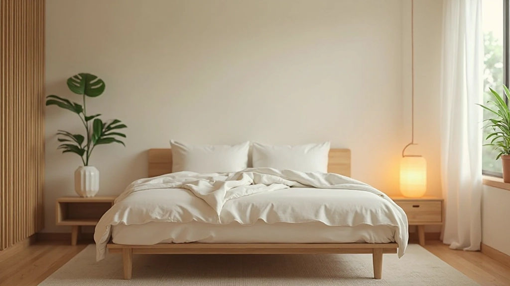
About This Article
This article provides educational information about color psychology and interior design principles. While color can significantly influence mood and well-being, it is not a substitute for professional mental health treatment. If you experience persistent sleep disorders, anxiety, or depression, please consult with qualified healthcare professionals. The design suggestions offered here are intended to create supportive living environments and should be personalized to your individual needs and circumstances.